
Data Visualization
Our consultants have a goal of assisting you in maximizing the potential of your data. This involves ensuring that you possess the appropriate tools and expertise to efficiently maneuver through your data with ease.
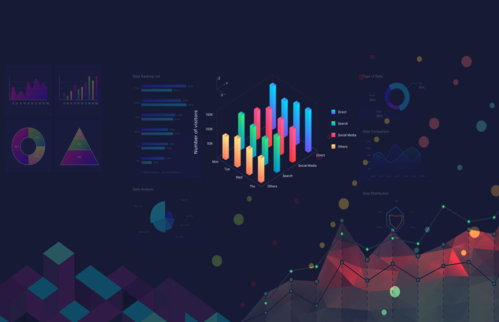
Our company specializes in transforming your business data into actionable insights that empower informed decision-making. As a prominent data visualization provider, we enable you to utilize visual elements such as charts, graphs, and more to visualize your data and gain valuable business intelligence. With our data visualization services, you can stay informed about your business trends and patterns, as well as the latest activities, by automatically gathering data from diverse sources. Our approach ensures that the information is presented in the most consumable format tailored to the data type, which helps you identify shifts in customer behavior and their underlying reasons, and make predictions about future outcomes.
Data visualization refers to the use of familiar graphic formats, including charts, plots, infographics, and animations, to represent data. The objective of visual displays is to present intricate data relationships and insights in a clear and concise manner.
Data visualization serves numerous purposes and is not exclusive to data teams. Management employs it to convey organizational structure and hierarchy, while data analysts and scientists use it to uncover and explain patterns and trends.
BI Dashboards incorporate engaging and actionable visuals, while also featuring performance architecture that facilitates seamless rendering of insights on both mobile and web devices. This design results in reduced load times and improved interaction for users.
Enhance your business intelligence and analytics capabilities through the power of data visualization. Our team specializes in creating comprehensive data dashboards and reports that cater to a diverse audience of business users, ranging from data analysts to those with limited analytics expertise
The process of preparing data is a common practice used to make datasets suitable for business intelligence (BI) and analytical applications. This process involves gathering, purifying, and merging unprocessed data to generate meaningful business insights.
Modernization efforts and next-generation platforms for business intelligence are intertwined, providing engineering teams with advanced methods to make informed decisions daily.
Various types of data analytics dashboards offer numerous benefits, including improved data visibility and accessibility, the ability to measure performance, facilitate business forecasting, and enable agile responses.
A dashboard offers one of the most significant advantages in presenting crucial data in a format that is intuitive, comprehensible, and beneficial for the average user. Its primary purpose is to provide users with a consolidated space to access key metrics and insights, allowing anyone within the organization to derive value from it.
Dashboards can be useful tools to monitor and track the performance of various teams, departments, products, and services. In order to evaluate the overall performance of an organization, it is essential to establish key performance indicators (KPIs) and gain access to targeted performance data. This enables the identification of inefficiencies in processes and facilitates the development of new strategies.
Dashboards facilitate rapid detection of data changes, empowering users to take swift action. By providing real-time updates, users can promptly adjust their course of action or proactively respond to upcoming trends.
AI and machine learning algorithms utilize both historical data and real-time data to detect patterns and outliers and predict potential issues before they escalate into major problems. By forecasting, these technologies can assist in guiding demand planning, financial operations, future production, risk mitigation, and digital marketing operations.
A methodology that utilizes diverse techniques to enhance comprehension of a dataset, reveal hidden patterns, extract crucial variables, identify outliers and irregularities, and assess underlying assumptions.
What is happening currently, based on incoming data? Typically, a real-time dashboard and/or email reports.
What is currently occurring based on incoming data? Normally, this is reflected in a real-time dashboard and/or email reports.
An analysis of this nature exposes the appropriate course of action, and it is deemed the most valuable form of analysis, typically leading to the formulation of guidelines and recommendations for subsequent actions.
An analytics dashboard serves as the control panel for your business, providing you with a comprehensive overview of your company’s performance, either in general or in detail. This powerful tool helps organizations quickly and easily identify workplace statistics based on Key Performance Indicators (KPIs). By enabling users to visualize and review data at a glance, dashboards enhance the overall efficiency of business analytics. Similarly, web analytics dashboards help businesses quantify and take action on information related to their online presence. In today’s data-driven business environment, visually-oriented big-data solutions are essential, especially since 41% of organizations report their current systems cannot effectively make sense of large volumes of data from various sources. Together, these analytics processes can significantly impact a company’s success.
Business Intelligence (BI) is a set of methods, techniques, and tools for the collection, integration, analysis, and presentation of business data. The goal of BI is to provide organizations with the information they need to make better decisions and improve their performance.
Data visualization is a key component of BI, which is the representation of data in the form of charts, graphs, maps, and other types of visual elements. Data visualization makes it easy to understand and interpret large amounts of data, which is particularly useful for identifying patterns, trends, and outliers in the data.
Examples of BI tools include data warehousing, reporting and analysis, dashboards, and scorecards.
Examples of data visualization tools include charting and graphing, mapping, and infographics.
BI and data visualization can be used in a wide range of industries, such as finance, healthcare, manufacturing, and logistics. They can be used to support decision-making in areas such as budgeting, forecasting, and resource allocation, and can help organizations to improve efficiency, reduce costs, and gain a competitive advantage.